

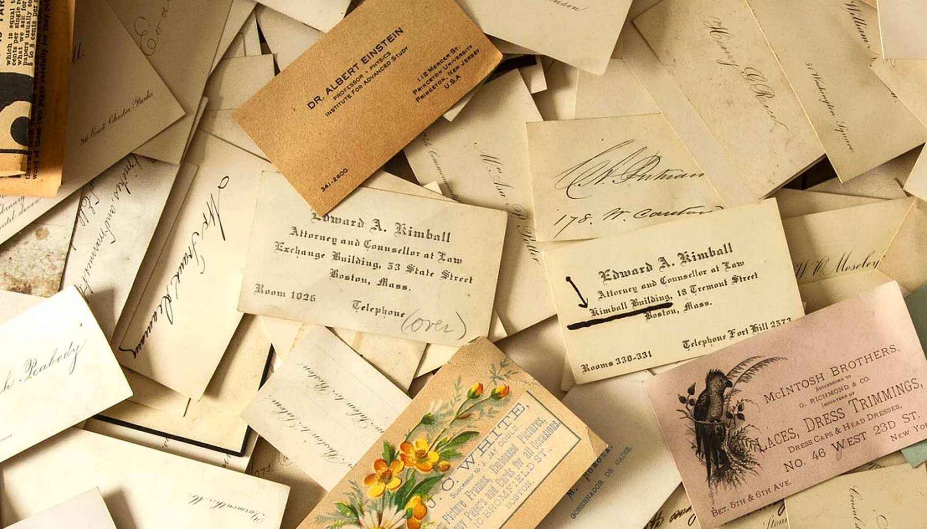
You hand over a business card that feels flimsy and gets lost in a stack. That cheap impression can cost you respect and opportunities. A traditional business card with substance signals you mean business.
Think of it as your handshake on paper. A premium card with a linen finish or thick stock tells people you are established and reliable. It is a small investment that pays off in credibility.
Why Classic Business Cards Still Matter in 2026
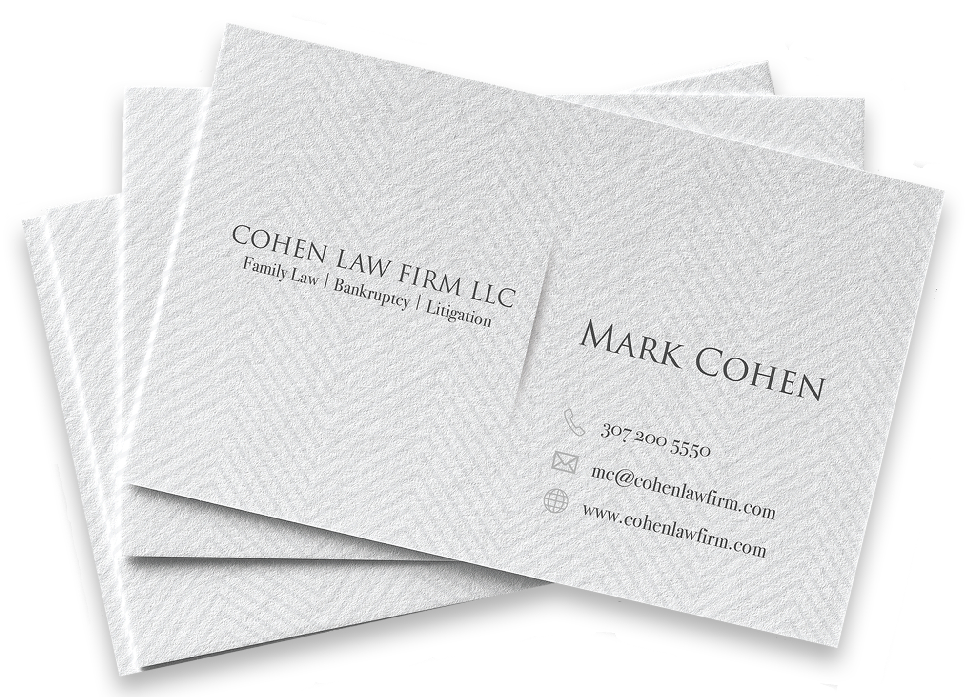
Traditional business cards follow the North American standard of 3.5 by 2 inches. This size fits perfectly in wallets and cardholders. Designers often choose serif fonts like Times New Roman or Garamond for a heritage feel.
Color palettes stay conservative with monochrome, deep blues, or cream tones. These colors project stability and are common in law and finance. The paper finish matters too: linen adds a woven texture that suggests craftsmanship, while matte keeps text easy to read.
You can order custom matte cards on 17.5pt stock from VistaPrint for a substantial feel. For a premium touch, try linen cards on 16pt Italian paper from Zazzle. Raised ink or foil stamping adds tactile appeal but leans more modern.
The Appeal of Classic Business Cards
Classic business cards offer a tangible connection in a digital world. They convey a sense of permanence and professionalism that screens cannot replicate.
Heritage Serif Font
Serif fonts like Garamond provide a distinguished and heritage feel. They suggest a long-standing tradition and attention to detail, perfect for professional business cards.
Monochrome Elegance
Monochrome business cards, often black and white, project sophistication. This minimalist approach ensures readability and a timeless aesthetic.
Read also: Register with Google Business in 2026 and get found on Maps
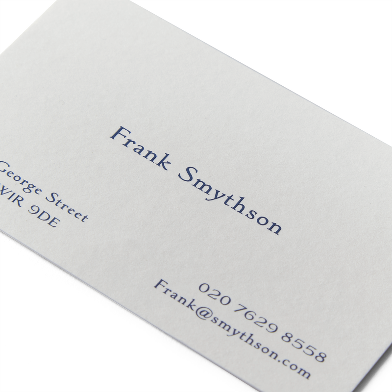
Linen Finish Texture
A linen finish business card adds a subtle woven texture. This tactile element elevates the card, making it feel more premium and memorable.
North American Standard Size
Adhering to the North American standard of 3.5′ x 2′ is crucial. This familiar size ensures your custom business cards fit comfortably in wallets and cardholders.
Vintage Business Cards with Raised Ink
Vintage business cards with raised ink offer a distinct tactile experience. The raised elements add a touch of luxury and emphasize key information.
Raised Ink Printing
Raised ink, also known as thermography, creates a slightly elevated print effect. This technique adds depth and a premium feel to elegant business cards.
Read also: The Best Checks for Payroll in 2026: Save Time & Money
Classic Typography
Choosing classic fonts is key for vintage business cards. Consider fonts that evoke a sense of history and established credibility.
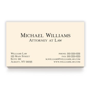
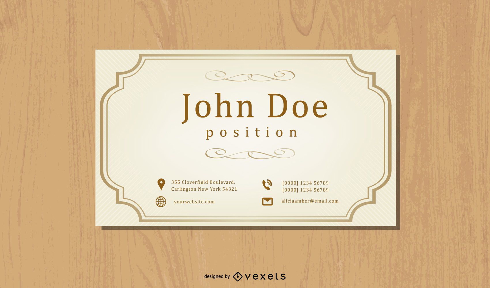
Cream Cardstock
Cream-colored cardstock complements vintage designs well. It offers a softer alternative to stark white, enhancing the heritage business cards’ appeal.
Subtle Embossing
Embossed details, even subtle ones, add a sophisticated touch. This technique creates a dimensional effect that draws the eye to important elements.
Professional Business Cards in Matte Finish
Matte finish business cards provide a sleek, modern look. Their non-reflective surface ensures excellent readability and a sophisticated feel.
Matte Coating
A matte coating eliminates glare, making text easy to read in any light. This finish is ideal for professional business cards that need to be clear and concise.
Clean Sans-Serif Fonts
Bold sans-serif fonts offer a contemporary edge. They are highly legible and pair well with the clean aesthetic of matte finish cards.
Minimalist Layout
A minimalist layout focuses on essential information. This design principle ensures your professional business cards are uncluttered and impactful.
Durable Cardstock
Opt for thicker cardstock, like 17.5pt, for a substantial feel. A durable matte finish business card suggests quality and longevity.
Elegant Designs with Embossed Details
Elegant designs with embossed details add a touch of luxury. Embossing creates a raised effect that adds texture and visual interest.
Embossed Logos
Embossing a logo makes it stand out physically from the card. This technique adds a sophisticated and memorable dimension to custom business cards.
Debossed Text
Debossing creates an indented effect, offering a subtle contrast. It is an elegant way to highlight names or taglines on premium business cards.
High-Quality Paper
Use heavy cardstock, such as 16pt or higher, for embossing. The paper needs to be thick enough to support the raised or indented design.
Subtle Color Palettes
Elegant designs often use muted or monochrome palettes. This allows the embossed details to be the primary focus of the card.
Minimalist Serif Font Business Cards
Minimalist serif font business cards blend classic typography with clean design. This combination creates a refined and understated professional image.
Classic Serif Typefaces
Serif fonts like Times New Roman lend an air of authority. They are excellent choices for heritage business cards aiming for a distinguished look.
Ample White Space
Generous white space is a hallmark of minimalist design. It allows the text and any simple graphics to breathe, enhancing readability.
Centered Layout
A centered layout provides balance and symmetry. This classic arrangement works well for serif font business cards needing a structured appearance.
Simple Contact Information
Focus only on essential contact details. This keeps the design clean and ensures the important information is easily found.
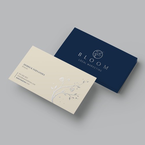
Heritage Business Cards with Linen Finish
Heritage business cards with a linen finish offer a unique tactile experience. The fabric-like texture adds a touch of old-world charm and quality.
Linen Paper Texture
The woven pattern of linen finish paper feels distinct. It provides a subtle grip and a sophisticated texture for custom business cards.
Natural Color Tones
Natural, earthy tones complement the linen texture. Consider creams, beiges, or light grays for a heritage feel.
Classic Font Choices
Pair the linen finish with classic serif fonts. This reinforces the heritage business cards’ timeless and established image.
Balanced Information Design
Arrange information clearly on the card. A well-balanced layout ensures the texture enhances, rather than distracts from, the details.
Premium Monochrome Business Cards
Premium monochrome business cards convey sophistication and focus. Black and white designs are timeless and project an image of understated luxury.
High-Contrast Printing
Achieve sharp contrast with quality black ink on white or off-white stock. This ensures your monochrome business cards are crisp and legible.
Thick Cardstock
Use heavy cardstock, at least 16pt, for a premium feel. A substantial card communicates quality and attention to detail.
Elegant Typography
Select refined fonts, whether serif or sans-serif, for your monochrome cards. The font choice significantly impacts the overall elegant business cards’ impression.
Matte or Soft-Touch Finish
A matte or soft-touch finish enhances the premium feel. These finishes avoid glare and add a luxurious tactile quality.
North American Standard Business Cards
North American standard business cards follow a specific size convention. This ensures consistency and ease of use across the continent.
Standard Dimensions
The industry-standard size is 3.5 inches by 2 inches. This dimension is recognized and fits easily into most wallets and card holders.
Clear Information Hierarchy
Organize your details logically within the standard layout. A clear hierarchy helps recipients quickly find the information they need.
Durable Paper Stock
Choose a sturdy paper stock, such as 14pt or 16pt, for durability. This ensures your professional business cards withstand regular use.
Versatile Design Options
This standard size accommodates various design styles. From minimalist to more detailed layouts, the North American standard business cards are highly adaptable.
Read also: 61 24 Hour Logo Ideas That Say ‘Always Open’ in Seconds
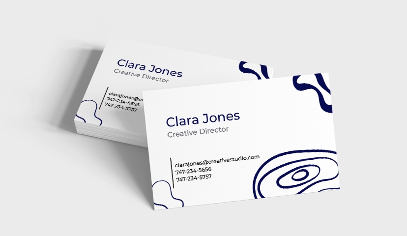
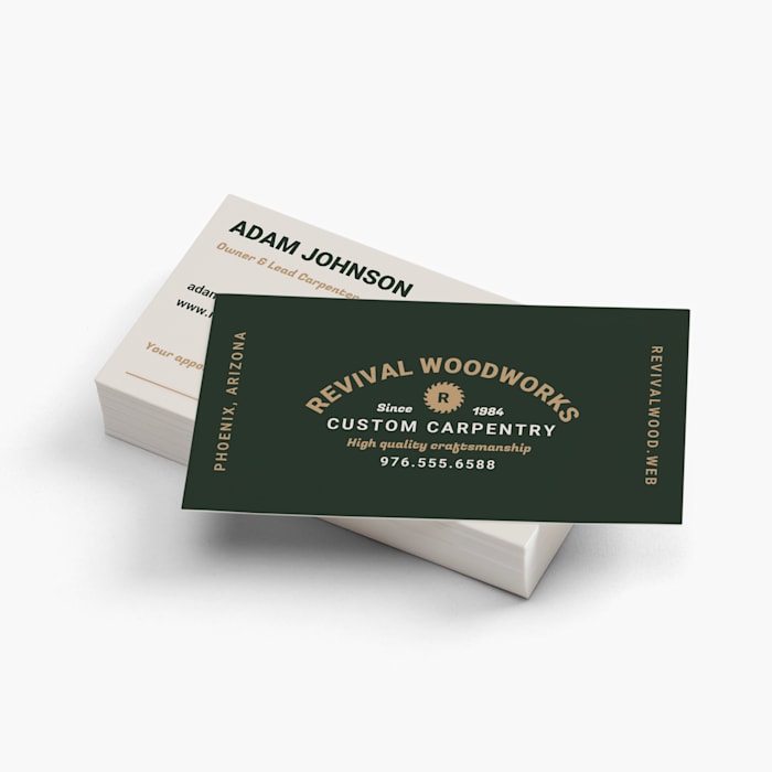
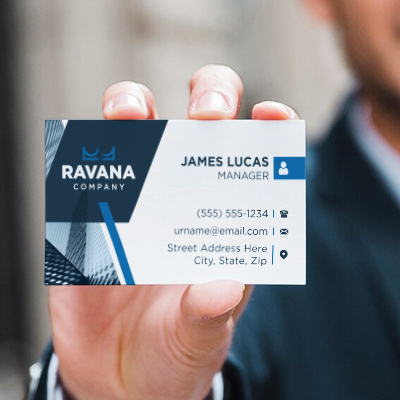
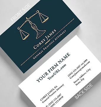
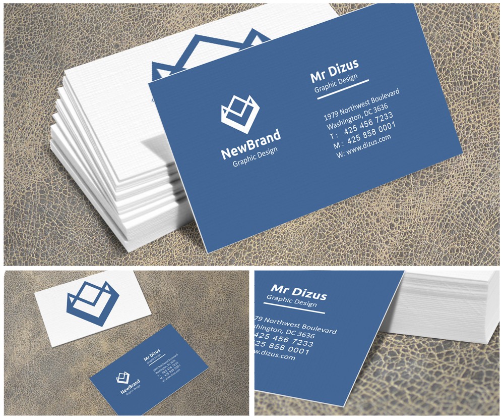
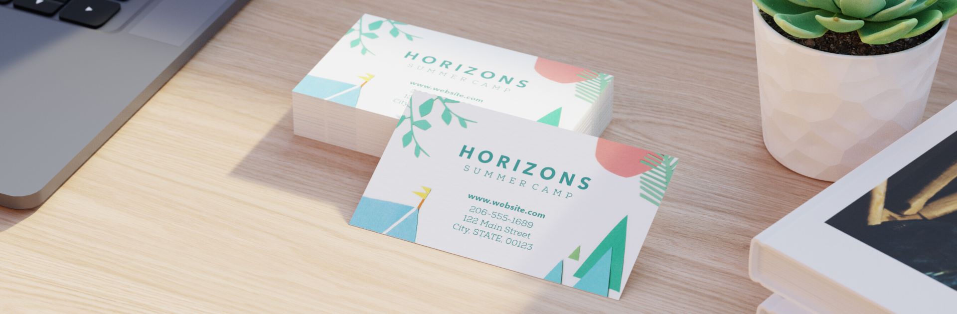
Style and Reference Gallery
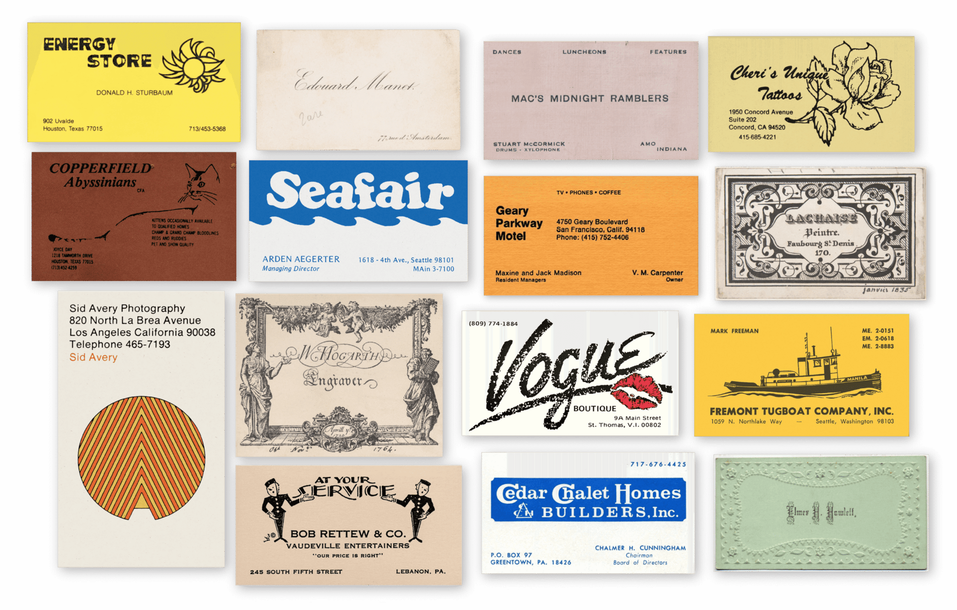
A double-sided card uses the back for a brief tagline or map. It maximizes the small canvas.
Rounded corners soften the rigid rectangle and prevent dog-ears. They hint at approachability.
A monogram logo in the center leaves room for contact details below. It balances elegance and function.
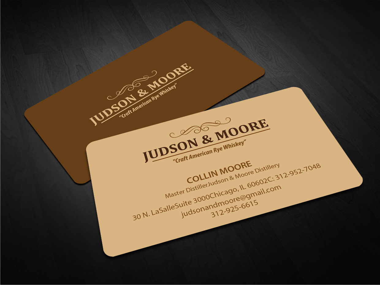
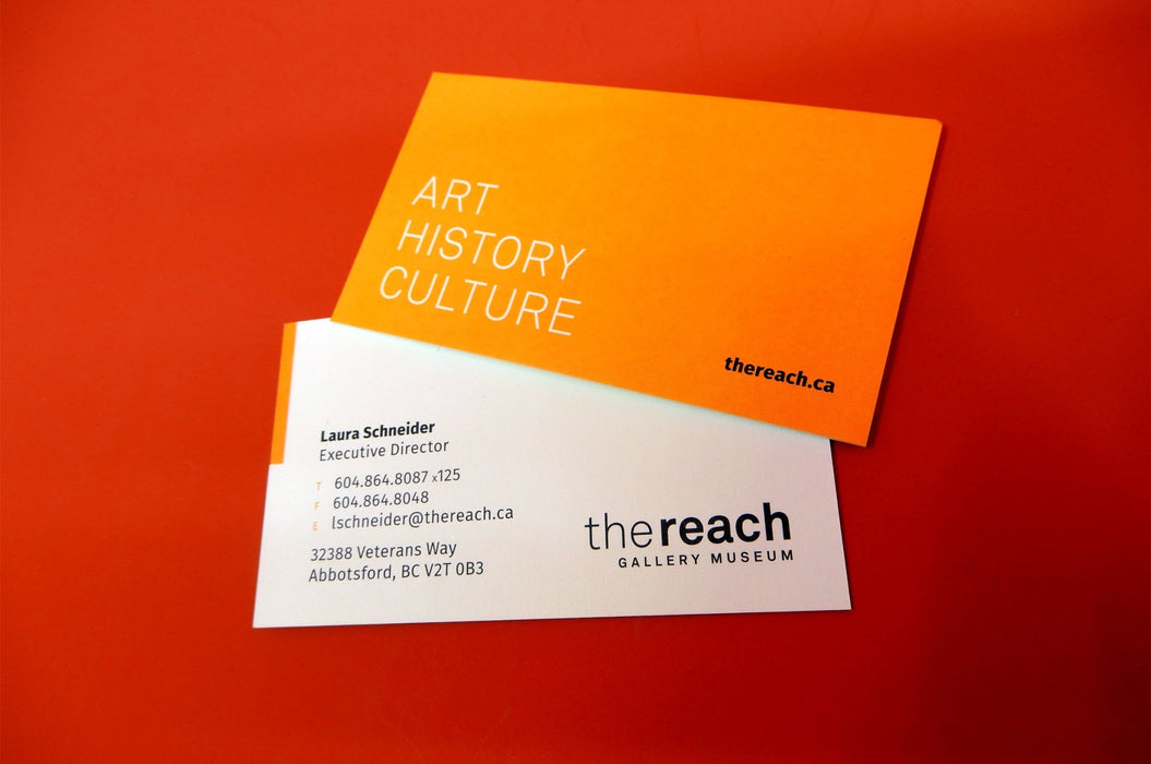
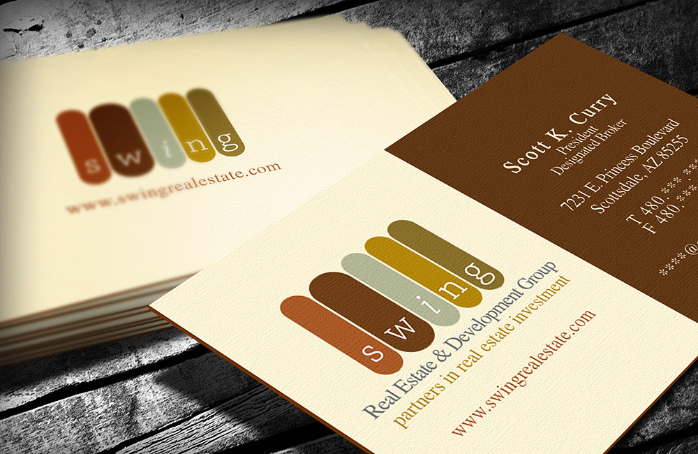
Burgundy paper with silver foil feels bold and confident. It works well for boutique consultancies.
A subtle watermark or pattern in the background adds depth without clutter. It rewards close inspection.
Matching envelope sets elevate the card into a complete stationery suite. They make a mailed impression.
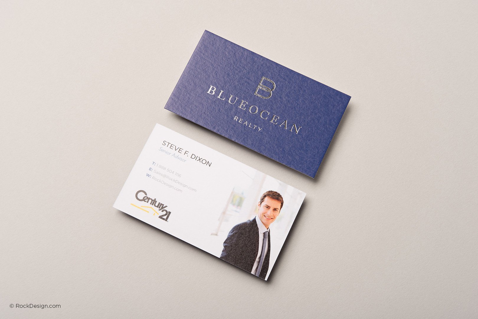
A QR code on the back links to your LinkedIn profile. It bridges the physical and digital seamlessly.
A matte black card with white embossed text exudes understated luxury. The contrast is sharp and unforgettable.
Cream linen paper adds a vintage warmth that invites touch. It feels like a letter from the past.
Deep navy blue paired with gold foil lettering suggests tradition and wealth. Perfect for law firms.
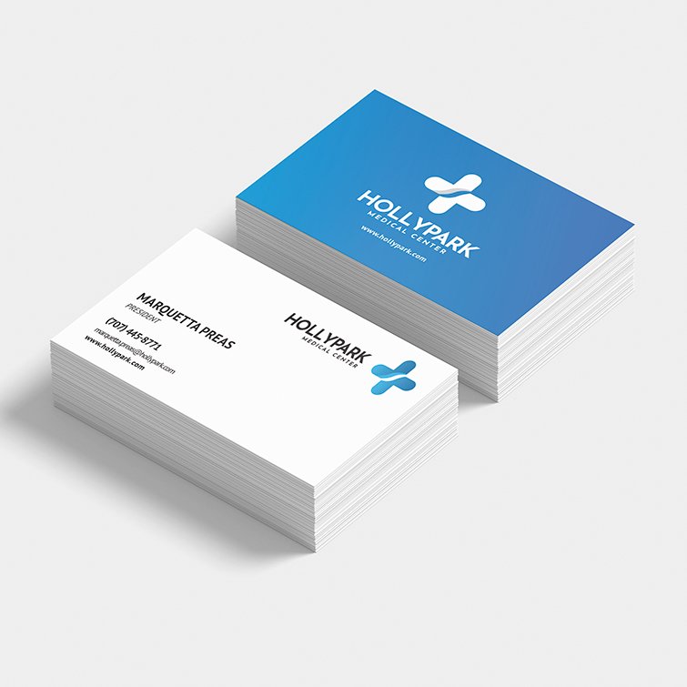
A clean white card with a single, centered logo speaks minimalism. It trusts the brand to do the talking.
Thick 17.5pt stock gives a satisfying weight that signals quality. You can feel the investment.
Raised ink creates a subtle texture that catches light. It makes your name literally stand out.
A horizontal layout with left-aligned text is easy to scan. It guides the eye naturally.
Making Traditional Business Cards That Impress
Step-by-Step Guide
Start with a clean template at 3.5′ x 2′ in design software like Canva or Adobe Illustrator.
Choose a serif font for a heritage feel or a bold sans-serif for modern clarity.
Select a matte or linen finish paper stock at least 14pt thick for durability.
Print a test batch on your home printer or order a sample from VistaPrint to check color and texture.
What to Avoid in Execution
Avoid glossy finishes that smudge easily and reflect light, making text hard to read.
Steer clear of tiny fonts below 8pt; they become illegible when viewed from a distance.
Do not overload the card with too many contact details; stick to name, title, phone, email, and website.
Skip cheap 12pt paper that feels flimsy and tears easily in a wallet.
Maintenance Tips
Store cards in a dedicated leather case to prevent bending and edge wear.
Keep them away from moisture and direct sunlight to avoid fading and curling.
Rotate your stack regularly so older cards get used first and stay fresh.
Wipe smudges gently with a dry microfiber cloth to maintain a crisp appearance.
Frequently Asked Questions
Can I design my own traditional business cards at home?
Yes, use free templates from Canva or Adobe Express, then print on matte cardstock from Amazon Basics.
For best results, order a professional sample first to ensure alignment and color accuracy.
What is the best paper weight for a traditional business card?
Aim for 14pt to 17.5pt stock; it feels substantial without being too thick for a wallet.
Lighter paper under 12pt feels cheap, while anything above 20pt may not fit standard card holders.
Should I include my photo on a traditional business card?
Only if your industry values personal recognition, like real estate or beauty services.
In corporate or legal fields, a logo and clean text project more authority than a photo.
Traditional business cards remain a powerful tool for establishing instant credibility and a memorable first impression.
By investing in quality paper and refined design, you signal professionalism and attention to detail.
Now, order a sample set from a trusted printer and feel the difference a well-crafted card makes in your next meeting.
Update your design every two years to keep your brand fresh while maintaining the classic appeal.
As networking evolves, the tactile elegance of a traditional card will always stand out in a digital world.
Embrace the timeless craft of a business card that speaks volumes before a word is spoken.