

Your trucking company business card gets tossed in a pile with twenty others. If it doesn’t grab attention in three seconds, you just lost a load. Most cards look the same: a generic truck clip art and boring font. That mistake costs you real money.
Your card is your first handshake with a broker or shipper. It needs to scream reliability before they even read your name. A well-designed card builds trust instantly, and trust gets your phone ringing. Let’s fix yours so it works as hard as you do.
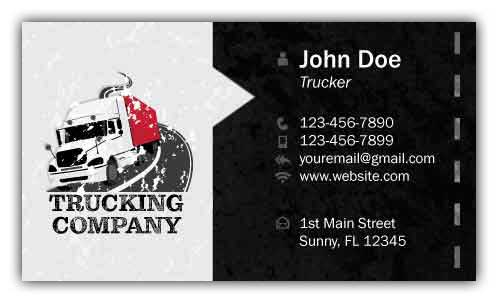
What Makes a Trucking Business Card Stand Out in 2026
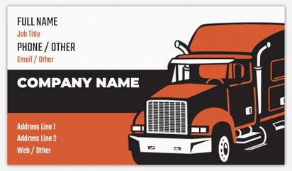
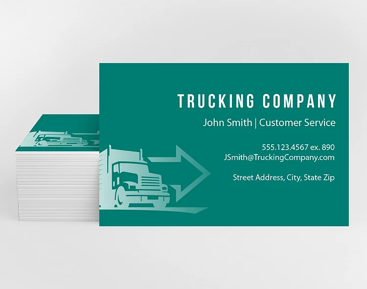
The best cards ditch the clip art and use a clean semi-truck silhouette or a bold logo. Colors like deep blue, red, or metallic silver signal strength and professionalism. Your card must include your DOT and MC numbers — those are trust signals that prove you’re legal and insured.
List your key services clearly: flatbed, reefer, hot shot, or heavy haul. Keep fonts readable and contact info easy to find. A QR code on the back can link to your digital freight profile or booking page, making it simple for clients to hire you on the spot.
Choose a matte or UV-coated finish so the card survives a truck stop or shipping dock. A flimsy card screams amateur. Spend a few extra cents per card to get thick stock from printers like Printit4Less or SoleSource. That small investment pays off in credibility.
Bold Typography for Owner Operator Cards
For owner operators, clear and strong typography is essential. It ensures your contact information stands out immediately. This approach projects confidence and professionalism to potential clients.
Impactful Sans-Serif Fonts
Choose fonts like Oswald or Bebas Neue for a commanding presence. These sans-serif styles are highly legible, even from a distance. They convey a sense of reliability for your owner operator business cards.
Thick Card Stock
Opt for a 16pt or thicker card stock for a premium feel. This adds weight and durability, making your logistics company business cards feel substantial. It shows you invest in quality for your freight broker business cards.
High Contrast Color Schemes
Use bold color combinations like black and white or deep blue and yellow. High contrast ensures readability and makes your dispatch business cards memorable. This is key for busy transport company business cards.
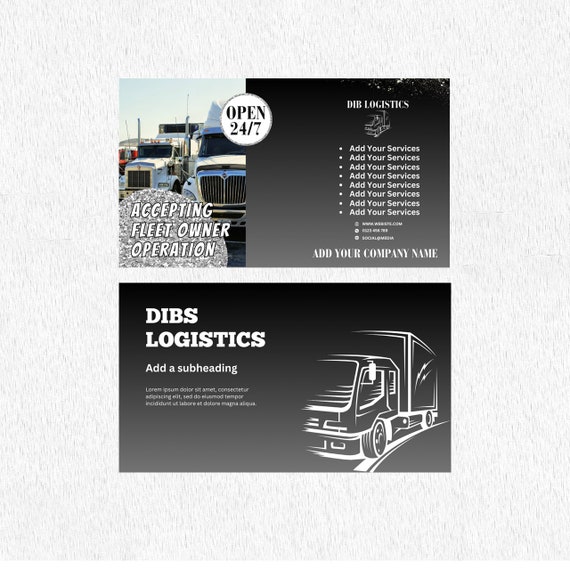
Minimalist Designs for Logistics Companies
Logistics companies benefit from clean and uncluttered designs. A minimalist approach communicates efficiency and organization. It helps potential clients quickly find key information on your hot shot trucking business cards.
Subtle Logo Placement
Place your company logo discreetly, perhaps in a corner or as a watermark. This keeps the focus on essential contact details for your moving company business cards. It maintains a professional look for your specialized hauling business cards.
Monochromatic Color Palettes
Stick to shades of a single color, like various blues or grays. This creates a sophisticated and unified look for your fleet management business cards. It reinforces brand consistency across all your carrier business cards.
Ample White Space
Ensure plenty of empty space on the card. This prevents visual clutter and makes the text easier to read. It is a hallmark of modern, professional design for transport company business cards.
Vintage Style for Freight Broker Cards

A vintage aesthetic can lend a sense of history and trustworthiness. This style evokes a feeling of established reliability for freight broker business cards. It can make your logistics company business cards stand out from modern designs.
Retro Font Selection
Explore fonts like Pacifico or Lobster for a nostalgic feel. These script or serif fonts add character and charm. They are perfect for creating unique truck driver business cards.
Distressed Textures
Consider adding subtle textures that mimic aged paper or wood grain. This enhances the vintage appeal of your owner operator business cards. It makes them feel more authentic and handcrafted.
Sepia or Muted Tones
Use color palettes featuring sepia, muted browns, or faded blues. These colors evoke a sense of the past. They are ideal for creating classic heavy haul business cards.
Illustrative Elements
Incorporate hand-drawn illustrations of old trucks or maps. These artistic touches add personality. They can make your specialized hauling business cards more engaging.
Colorful Graphics for Hot Shot Trucking
Hot shot trucking often involves speed and dynamism, which colorful graphics can represent. Bright colors grab attention and convey energy. This makes your hot shot trucking business cards highly visible.
Vibrant Color Gradients
Use smooth transitions between bright colors like orange, yellow, and red. Gradients add depth and a modern feel. They make your transport company business cards pop.
Bold, Graphic Icons
Employ sharp, stylized icons representing speed or movement. These graphics are easily understood. They enhance the visual appeal of your dispatch business cards.
Custom Illustrations
Commission unique illustrations that reflect your brand’s personality. A custom graphic can make your hot shot trucking business cards truly unique. It differentiates you from other carrier business cards.
Matte Finish with Spot UV
A matte finish provides a smooth base for vibrant colors. Spot UV highlights specific graphic elements. This contrast makes your moving company business cards more tactile and visually striking.
Professional Look for Fleet Management Cards
Fleet management requires an image of organization and control. Professional design elements are key to conveying this. Your fleet management business cards should reflect efficiency and reliability.
Clean, Geometric Layouts
Use grids and balanced spacing to create a structured appearance. Geometric shapes add a modern, organized feel. This is crucial for logistics company business cards.
Conservative Color Palettes
Stick to blues, grays, and whites for a serious, business-like tone. These colors are associated with stability and trust. They are standard for carrier business cards.
Legible Serif Fonts
Serif fonts like Times New Roman or Garamond add a touch of tradition and authority. They are easy to read and convey a sense of dependability. This is important for owner operator business cards.
Inclusion of DOT/MC Numbers
Prominently display your DOT and MC numbers. These are vital trust signals for regulatory compliance. They are non-negotiable on all trucking company business cards.
Modern Aesthetics for Transport Company Cards
Modern transport company cards embrace sleek lines and current design trends. They aim to project innovation and efficiency. This look appeals to clients seeking contemporary logistics solutions.
Minimalist Icons and Logos
Use simple, flat icons and a clean company logo. This keeps the design uncluttered. It ensures your transport company business cards look current.
Abstract Backgrounds
Consider subtle abstract patterns or gradients. These add visual interest without being distracting. They provide a sophisticated backdrop for your freight broker business cards.
QR Codes
Integrate a QR code linking to your website or tracking portal. This offers a digital connection. It is a modern feature for dispatch business cards.
Sleek Finishes
Choose finishes like soft-touch laminate or spot UV. These add a premium tactile experience. They enhance the modern feel of your hot shot trucking business cards.
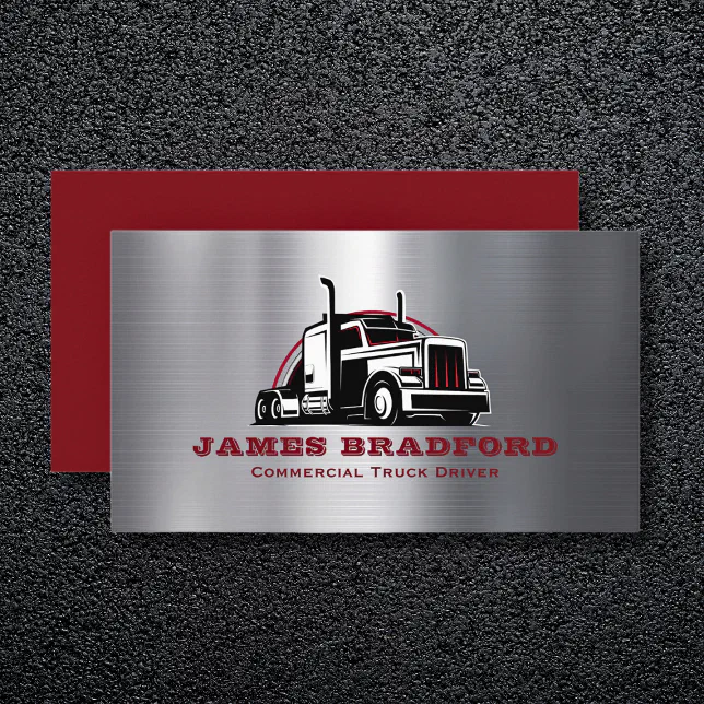
Classic Charm for Heavy Haul Business Cards
Heavy haul business cards benefit from a design that suggests strength and experience. A classic look conveys stability and capability. This style is well-suited for specialized hauling business cards.
Robust Slab Serif Fonts
Fonts like Rockwell or Arvo have a strong, sturdy appearance. They communicate power and reliability. These are excellent choices for heavy haul business cards.
Metallic Accents
Incorporate elements like silver or gold foil stamping. These add a touch of prestige and durability. They make your carrier business cards feel more substantial.
Embossed Logos
Embossing your logo creates a raised effect that adds texture. This technique conveys a sense of quality. It is a classic touch for owner operator business cards.
Dark, Rich Color Schemes
Use deep colors such as navy blue, forest green, or charcoal gray. These colors suggest depth and seriousness. They are fitting for transport company business cards.
Clean Layout for Carrier Business Cards
A clean layout is paramount for carrier business cards to ensure clarity. It makes all essential information easy to find. This approach projects professionalism and attention to detail.
Generous Margins
Ensure ample space around the edges of the card. This framing effect improves readability. It makes your carrier business cards appear more polished.
Clear Information Hierarchy
Organize information logically, with the most important details most prominent. Use font sizes and weights to guide the reader’s eye. This is crucial for owner operator business cards.
Simple Color Palettes
Limit your color choices to two or three complementary colors. A restrained palette keeps the focus on the content. It is effective for logistics company business cards.
Standard Card Sizes
Stick to the standard 3.5 x 2 inch size for easy handling and storage. This ensures compatibility with wallets and card holders. It is a practical choice for all trucking company business cards.
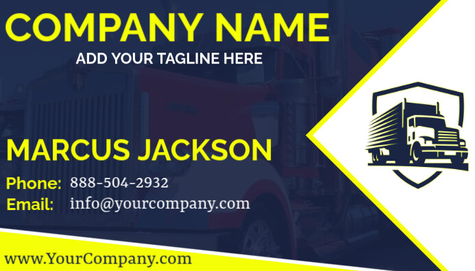
| Design Element | Recommendation | Why |
| Typography | Bold Sans-Serif (Oswald) | High visibility, modern feel |
| Material | 16pt Card Stock | Durability, premium feel |
| Color | High Contrast (Black/Yellow) | Readability, attention-grabbing |
| Finish | Matte with Spot UV | Tactile appeal, visual pop |
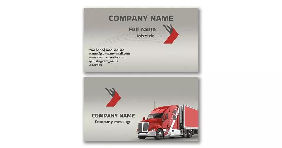
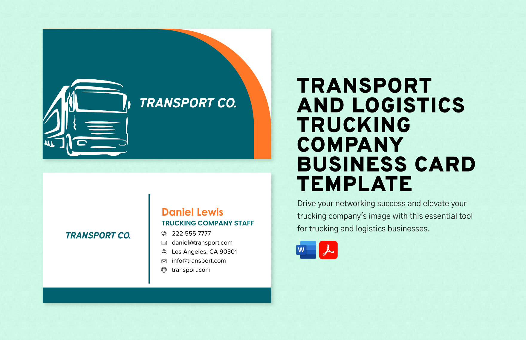
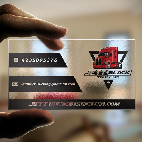
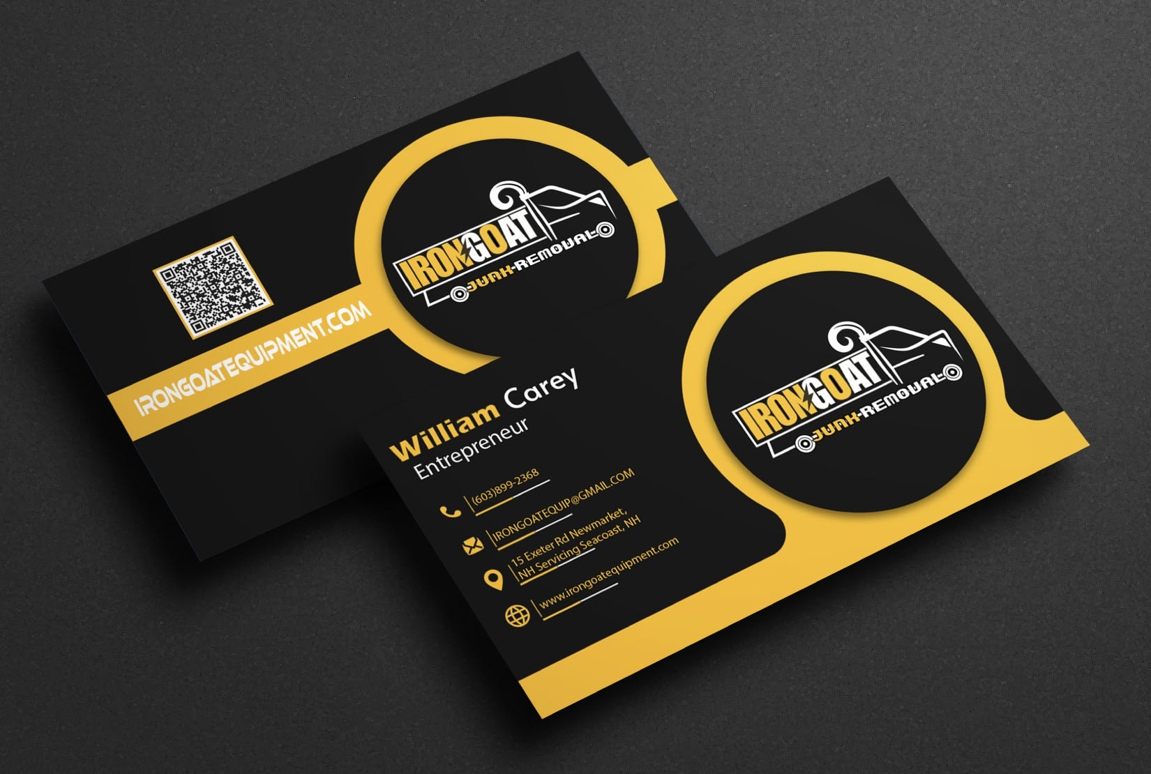
Style and Reference Gallery
Print your MC number below the logo in a smaller font. It’s a legal requirement that also proves you’re insured.
QR codes on the back link to your real-time tracking portal. Brokers love seeing load status without calling.
Choose a 14pt card stock that feels substantial in hand. Thin cards get lost in a wallet or tossed in the trash.
Leave white space around your contact info for notes. Brokers often jot down rates or pickup numbers on the card.

Add a tagline like ‘On-Time, Every Time’ under your name. It reinforces your reliability promise with every handoff.

Test your card’s durability by rubbing it with a greasy finger. The ink should not smudge or fade after a day in your pocket.

Order from Printit4Less for bulk runs with foil stamping. Foil adds a premium feel that stands out in a stack of plain cards.
Update your card every year with current insurance certificates. Outdated info makes you look unprofessional and risks losing loads.
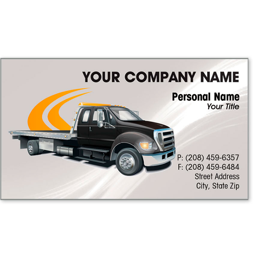
A stark semi-truck silhouette on a deep blue background signals strength. Keep the logo simple so it sticks in memory.

Use bold sans-serif fonts for your company name. They remain legible under dim dock lights and greasy fingers.
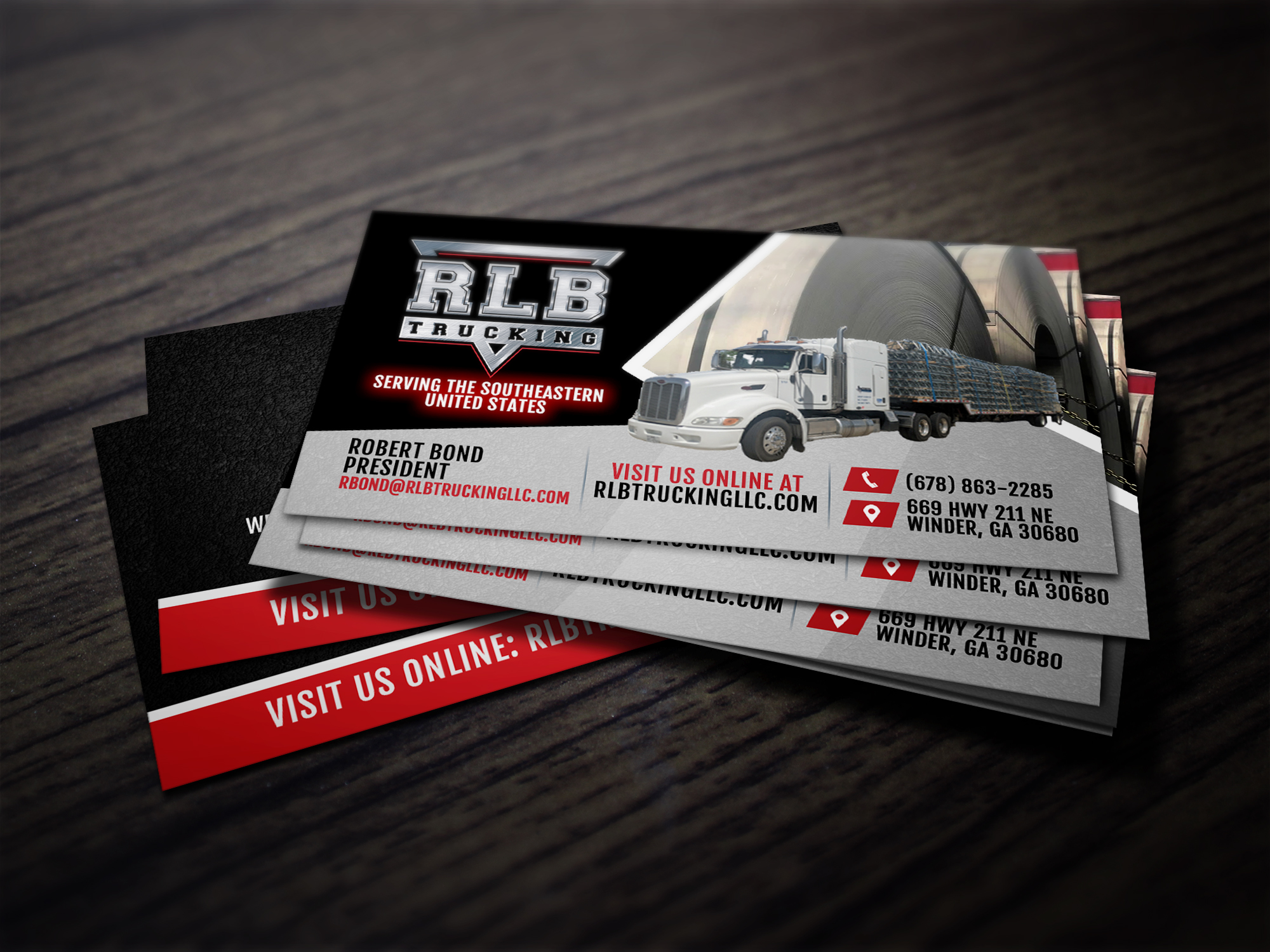
Add a red accent stripe to mirror your truck’s paint job. Color consistency builds brand recognition across your fleet.

List your services in bullet points: Flatbed, Reefer, Hot Shot. This saves brokers time matching your capacity to their load.

Place your phone number in the top corner so it’s the first thing seen. A dispatcher needs to dial fast without squinting.
Get Your Cards Printed Right
Step-by-Step Guide
Start by choosing a template on Zazzle or Etsy that matches your fleet’s colors. Upload your logo, DOT and MC numbers, and service list, then order a sample pack to test paper quality.
What to Avoid in Execution
Never use glossy finishes—they smudge in greasy truck stop conditions. Skip fancy fonts that make your phone number hard to read at a glance.
Maintenance Tips
Store cards in a metal case to prevent bending in your pocket. Replace them every six months or when your dispatch email changes to keep info current.
Frequently Asked Questions
- Do I really need DOT and MC numbers on my card?
Yes, they are trust signals that prove you’re a legal carrier. Shippers and brokers check these before hiring you.
- Should I add a QR code?
Yes, link it to your load board profile or instant quote page. It makes it easy for drivers to book you on the spot.
- What’s the best card stock for trucking?
Go with 14pt matte or UV-coated stock. It resists oil, moisture, and bending from being stuffed in a glovebox.
Your business card is your rolling resume—it must speak reliability before you say a word. By including DOT numbers and a clean design, you build instant trust with brokers and shippers.
Order a small batch first, test them at a truck stop, then commit to 500 cards. Next, update your website and load board profiles to match the card’s look.
Imagine a driver pulling your card from a stack at a dock—clean, sturdy, and readable. That card will get you the next load, not just a glance.