

Your business card is the first handshake with a potential client. If it looks cheap or flimsy, they will assume your work is the same. A general contractor business card must be built as tough as your reputation.
Skip the basic glossy paper from the office supply store. In 2026, clients expect a card that can survive a toolbox and still look professional. The right card can land you a six-figure remodel job.
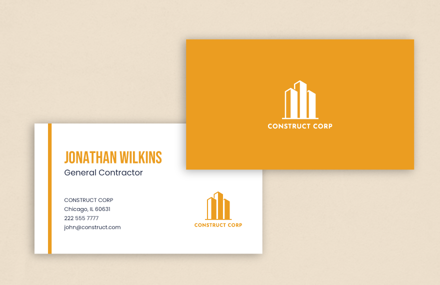
Design a Contractor Business Card That Commands Respect
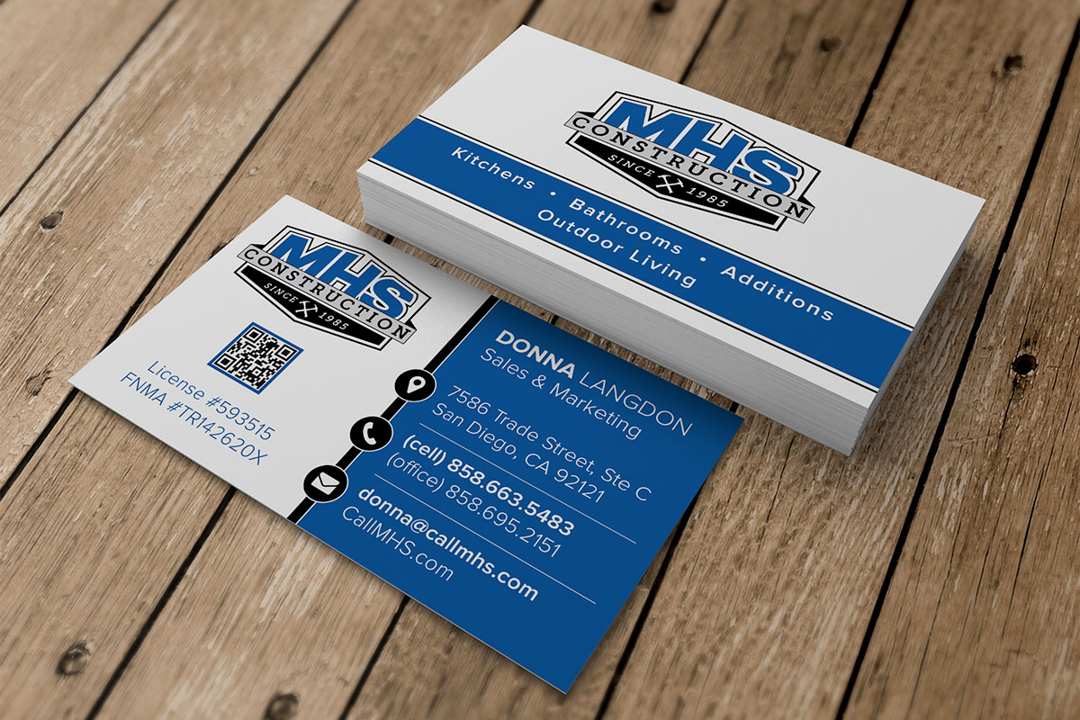
Your card needs to say ‘Licensed, Bonded, and Insured’ without being cluttered. Include your state license number, like LIC #123456, right below your name. This single line builds instant trust that your competitors often miss.
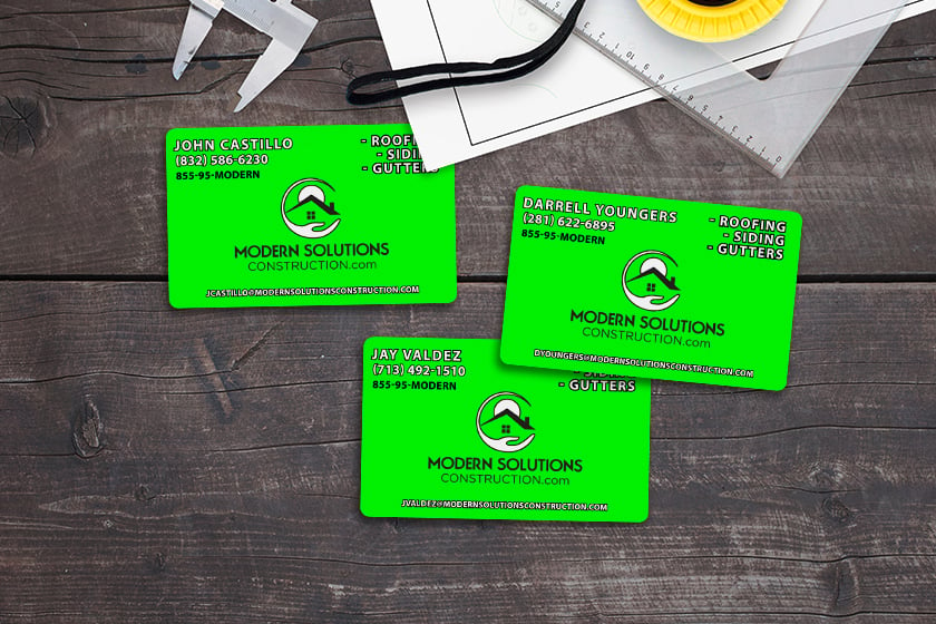
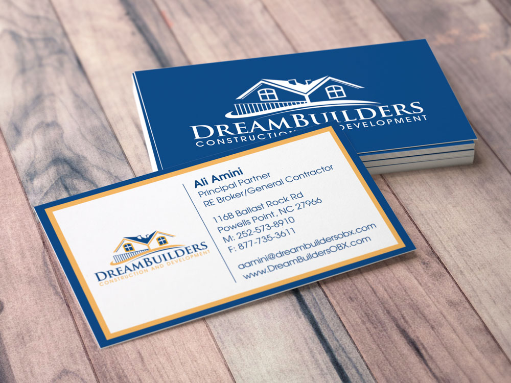
Choose a modern minimalist design with a matte black or deep navy background. Add a subtle blueprint pattern or a tool silhouette for a trade-specific touch. Avoid bright colors unless you work in commercial safety, then go with high-visibility yellow or orange.
Material matters more than you think. Go with 18pt matte cardstock or a waterproof PVC plastic card. These options resist dirt, moisture, and bending, keeping your info readable after weeks in a client’s wallet.
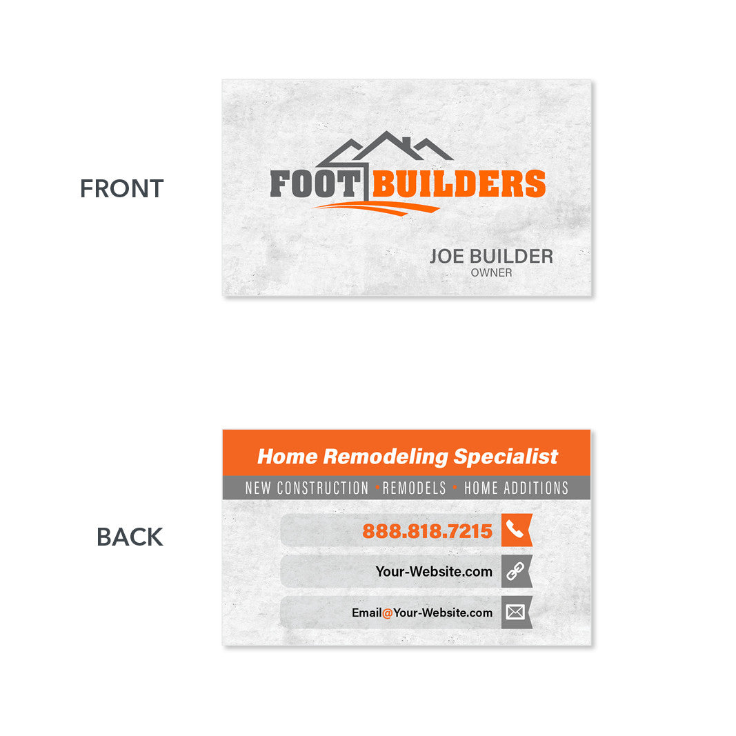
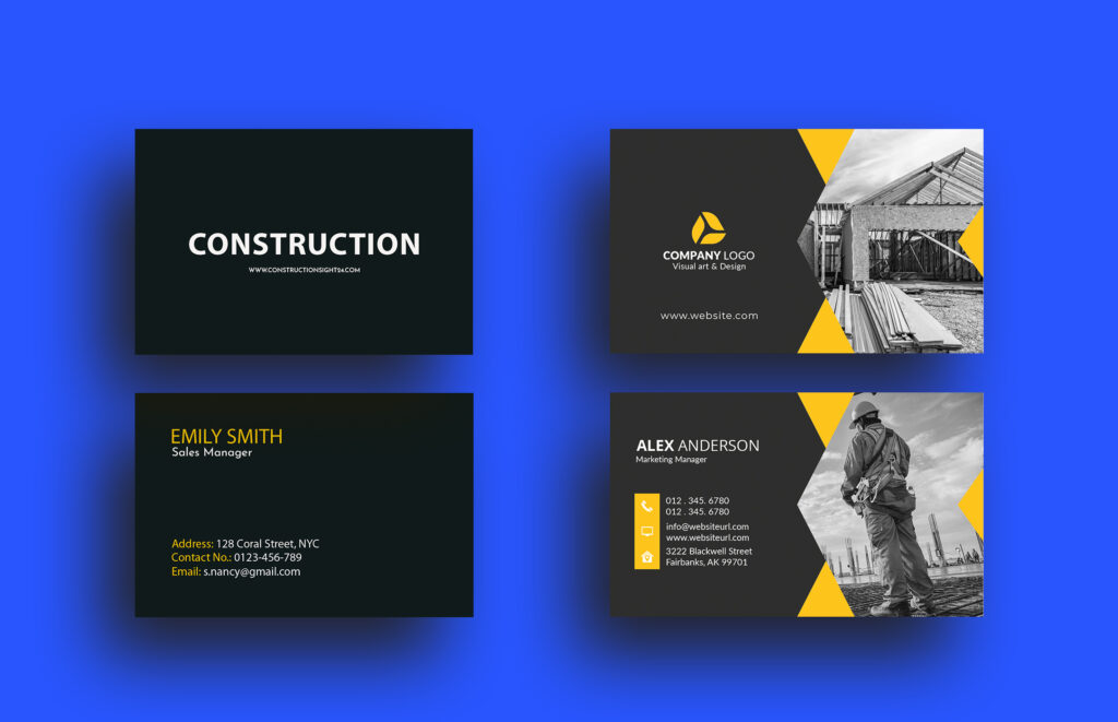
Bold Construction Card Design
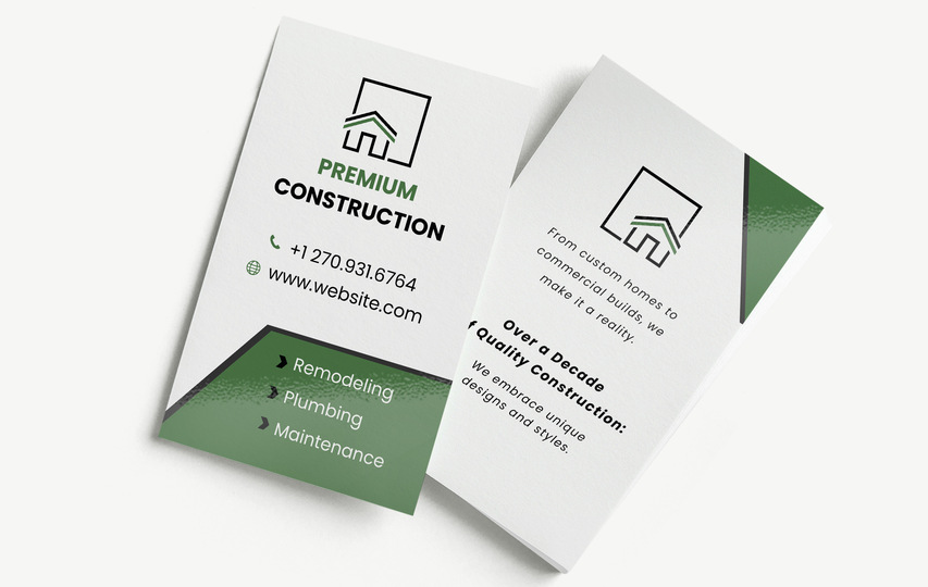
A bold design makes a strong first impression. It communicates confidence and a no-nonsense approach to business. This style is perfect for contractors who want to stand out.
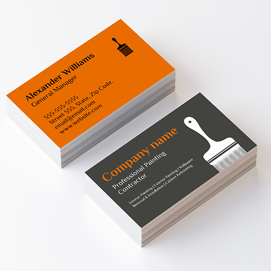
Safety Orange Matte Cardstock
This vibrant orange grabs attention immediately. It pairs well with black text for high contrast. Consider 16pt contractor cards for a sturdy feel.
Deep Navy with Geometric Lines
A dark navy base offers a sophisticated yet bold look. Geometric lines add a modern, structural element. This design works well for commercial contractor cards.
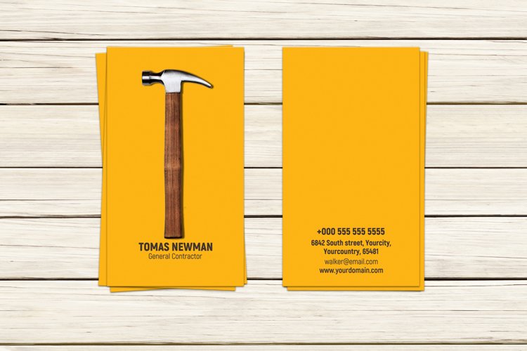
High-Contrast Black and Yellow
This classic bold combination is highly visible. It evokes a sense of urgency and professionalism. It’s a great choice for heavy duty contractor cards.
Bold Sans-Serif Typography
Large, clean sans-serif fonts make your name and services easy to read. This typography reinforces the bold message. It ensures your contractor business cards are impactful.
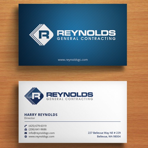
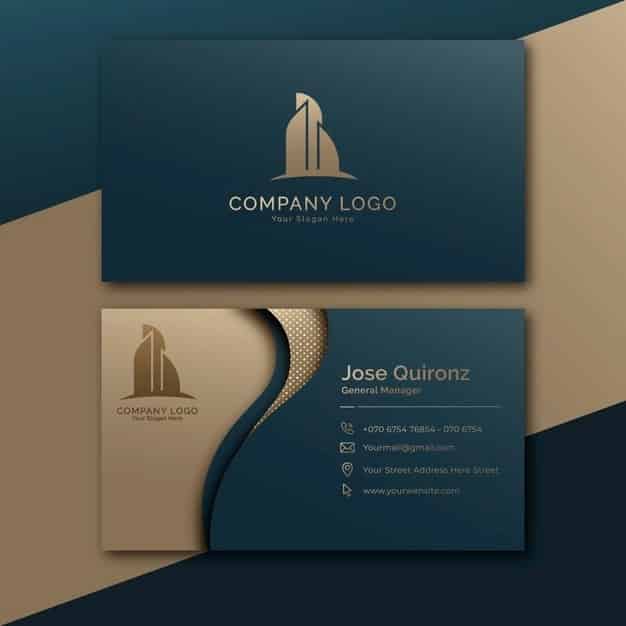
Minimalist Contractor Business Card
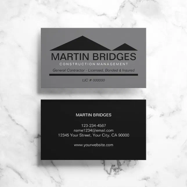
Minimalist designs convey professionalism and clarity. They focus on essential information without clutter. This approach builds trust through simplicity.
White Cardstock with Black Text
Clean white and stark black is the epitome of minimalism. It’s easy to read and looks very professional. This is a popular choice for modern contractor card design.
Subtle Gray and White Palette
A soft gray on white offers a gentle, understated look. It feels clean and organized. This minimalist contractor card design is very versatile.
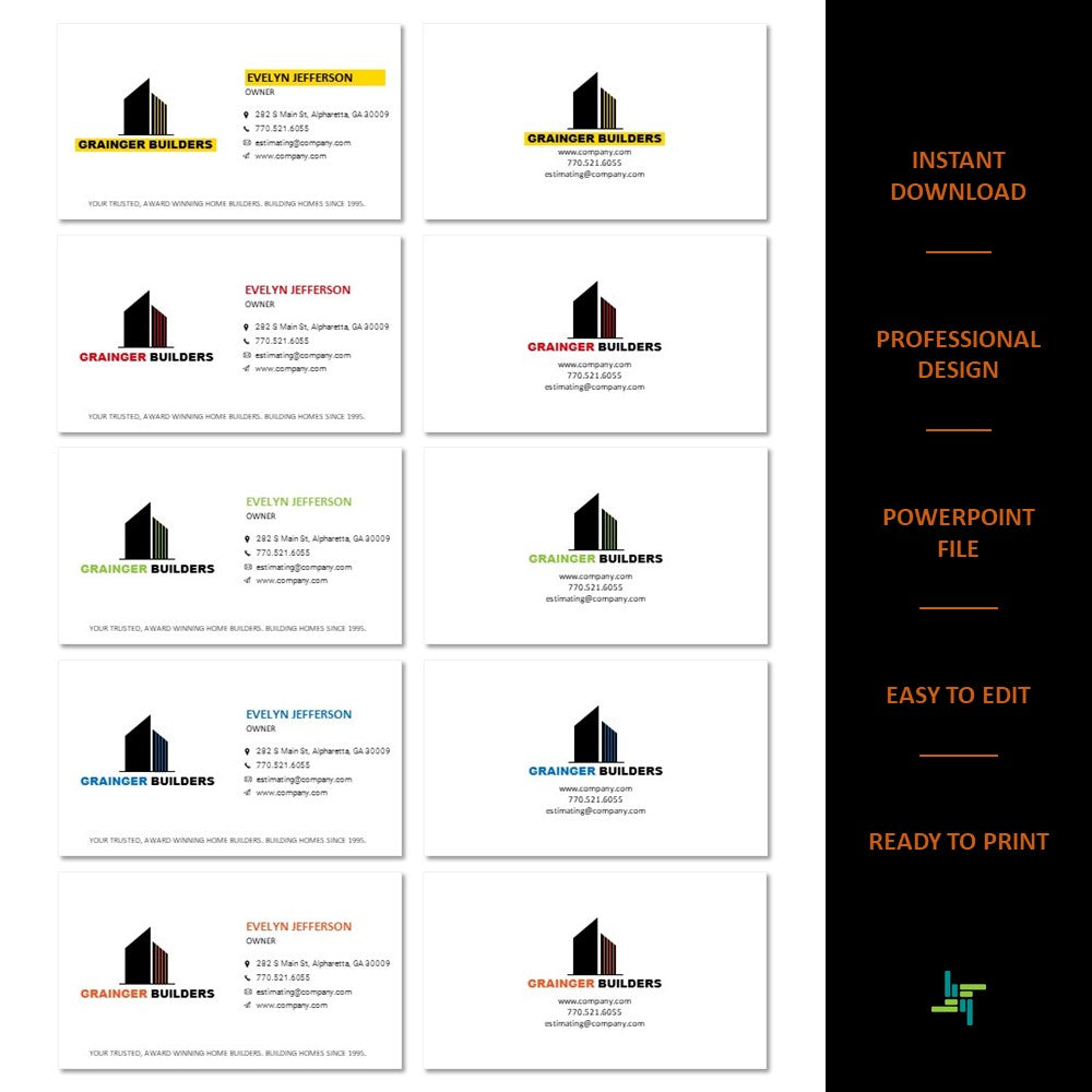
Single Color Logo Focus
Highlighting your logo in a single, strong color works well. It keeps the design clean and memorable. This helps your brand stand out on contractor business cards.
Ample White Space
Generous white space makes the card feel less crowded. It draws the eye to key details. This is a hallmark of a good minimalist contractor card.
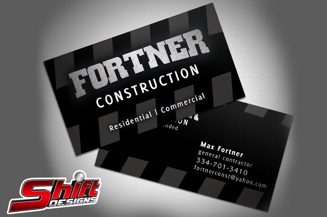
Industrial Contractor Card Style
Industrial designs reflect strength and durability. They often use darker colors and robust textures. This style suits contractors working in heavy-duty fields.
Matte Black PVC Cards
PVC contractor cards are incredibly durable and waterproof. A matte black finish adds a sleek, industrial feel. These are excellent heavy duty contractor cards.
Textured Gray Cardstock
A textured gray cardstock can mimic concrete or metal. It provides a tactile experience. This adds to the industrial contractor card style.
Blueprint Blue Accents
Using blueprint blue as an accent color is fitting. It connects to construction planning. This adds a unique touch to builder business cards.
Heavy Gauge Cardstock (18pt)
Thicker cardstock, like 18pt contractor cards, feels substantial. It communicates quality and resilience. This supports the industrial contractor card style.
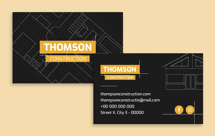
Blueprint Business Card Aesthetic
A blueprint aesthetic directly links to the construction process. It uses lines and technical drawings. This design appeals to clients seeking precision.
Light Blue Background with White Lines
This mimics the look of traditional blueprints. It’s instantly recognizable. This blueprint business card aesthetic is very effective.
Architectural Line Drawings
Incorporate simple line drawings of structures or tools. They add detail without being overwhelming. This enhances the blueprint business card aesthetic.
Grid Patterns
Subtle grid patterns can evoke graph paper or site plans. They add a technical feel. This works well for new construction business cards.
Clear, Technical Font
Use a font that looks precise and technical. Avoid overly decorative styles. This complements the blueprint business card aesthetic.
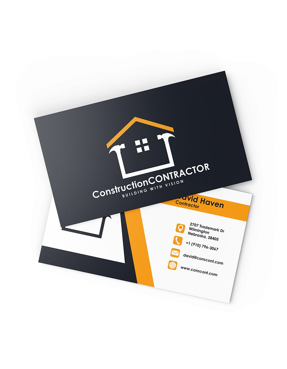
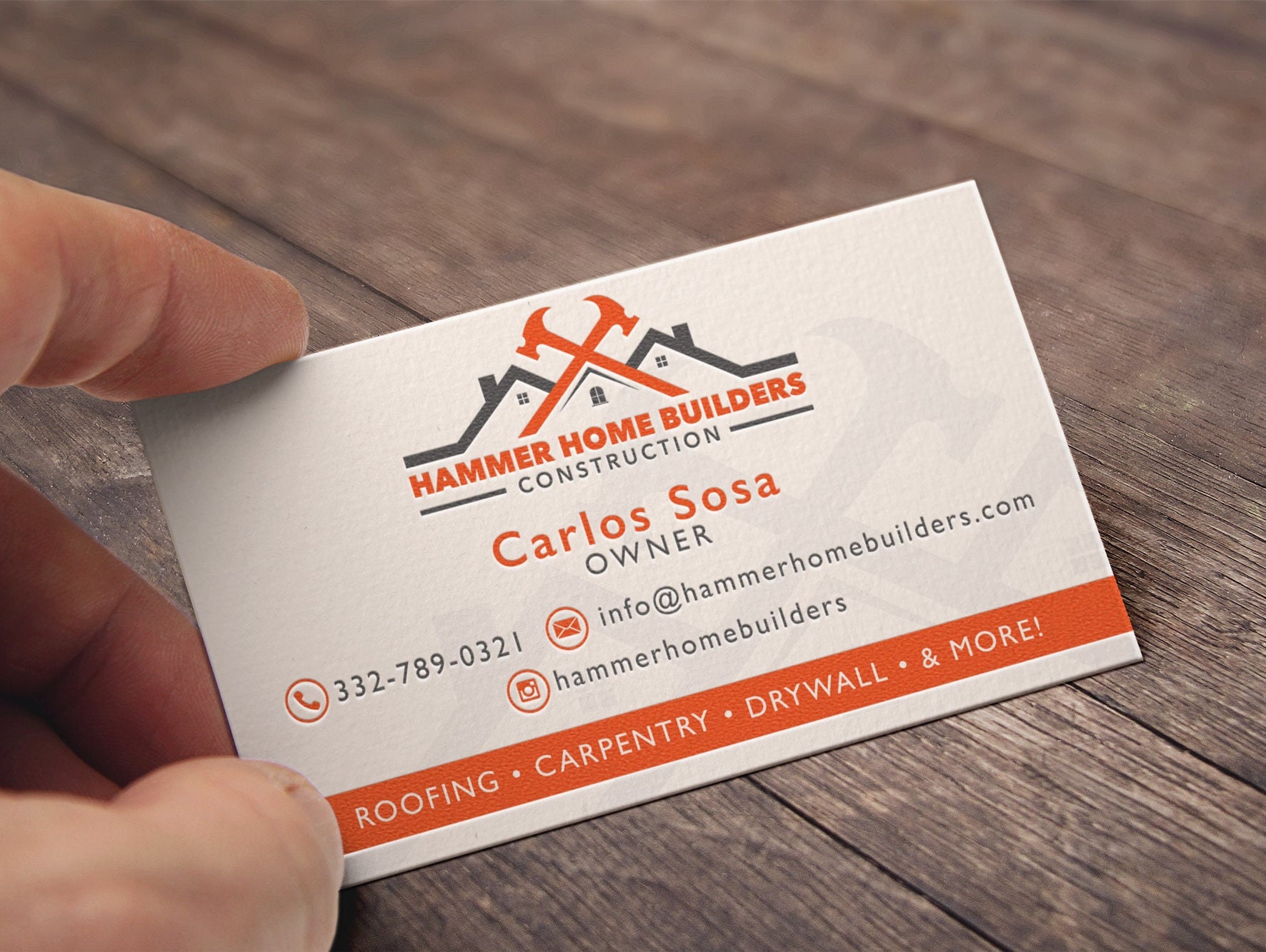
Tool Silhouette Contractor Card
Tool silhouettes are a clear visual cue for trades. They are simple yet effective icons. This adds a personal touch to contractor business cards.
Hammer and Wrench Silhouette
A classic combination that signifies building and repair. It’s a universally understood symbol. This works for many types of contractor business cards.
Circular Saw Blade Icon
This silhouette is dynamic and suggests cutting and precision. It’s a strong visual for remodeling business cards. It adds a unique element to builder business cards.
Abstract Tool Shapes
Consider more abstract shapes that hint at tools. This can create a modern look. It keeps the design sophisticated for commercial contractor cards.
Integrated Logo and Silhouette
Combine your logo with a subtle tool silhouette. This creates a unique brand mark. It makes your contractor business cards memorable.
Tactile Business Card for Contractors
Tactile elements engage more senses, making the card memorable. Texture adds a premium feel. This helps your card stand out from the stack.
Matte Cardstock with Raised Print
Matte cardstock provides a soft, non-glossy feel. Raised print adds a tactile dimension. This makes information feel more important on contractor business cards.
Embossed Logo
An embossed logo creates a raised design. It’s subtle but adds a luxurious touch. This tactile business card for contractors conveys quality.
Soft-Touch Coating
This coating gives the card a velvety feel. It’s smooth and pleasant to the touch. It elevates the perceived value of your builder business cards.
Die-Cut Shapes
Unusual shapes make the card unique and memorable. It’s a bold tactile choice. This can make your construction business cards unforgettable.
Spot UV Accent on Contractor Cards
Spot UV adds a glossy, raised finish to specific areas. It creates contrast with matte surfaces. This draws attention to key elements.
Glossy Logo on Matte Background
Applying Spot UV to your logo makes it pop. The contrast between gloss and matte is striking. This is a popular feature for modern contractor card design.
Highlighting Contact Information
Use Spot UV on your name or phone number. This makes critical details stand out. It ensures clients can easily find how to reach you.
Textured Pattern with Spot UV
Apply Spot UV over a subtle pattern. This creates a unique visual and tactile effect. It adds depth to your construction business cards.
Spot UV on Key Services
Highlighting your main specialties with Spot UV works well. It draws the eye to what you do best. This is effective for remodeling business cards.
Foil Accent Business Card for Contractors
Foil accents add a metallic shine that catches the light. They bring a touch of elegance and prestige. This makes your card feel high-end.
Gold Foil on Dark Cardstock
Gold foil on a deep navy or black card is classic. It looks luxurious and professional. This works well for commercial contractor cards.
Silver Foil for a Modern Look
Silver foil offers a sleek, contemporary feel. It pairs nicely with gray or white designs. This is a great choice for modern contractor card design.
Rose Gold Foil Accents
Rose gold adds a unique, warm metallic touch. It stands out from traditional gold or silver. Consider this for a distinctive builder business card.
Foil Stamped Logo
Using foil for your logo makes it a focal point. It adds a premium finish. This foil accent business card for contractors makes a statement.
Style and Reference Gallery
Two-sided card: contact info on front, project photo on back. Shows your work.
Foil-stamped wrench icon on matte navy. A subtle trade symbol.
Clear PVC card with white text. Ultra-durable and futuristic.
Vertical layout with sans-serif font. Stands out in a stack of horizontals.
Edge painting in brand color. A premium detail that catches the eye.
Minimalist design with only name, phone, and license. Pure confidence.
Folded card with a mini portfolio inside. Gives clients a reason to keep it.

Matte black card with silver foil logo. It whispers luxury and durability.

Safety yellow background with heavy black text. Bold and impossible to lose.
Blueprint pattern as a subtle watermark. Instantly signals construction expertise.
Rounded corners on thick plastic. Feels modern and survives the toolbox.
Your Business Card: The Blueprint to Trust
Step-by-Step Guide to a Winning Card
- Choose the right material. Go with 16pt thick matte cardstock or durable plastic/PVC. These survive the job site and feel premium.
- Lock in your non-negotiables. Include your full name, title, business name, license number, and phone/email. State ‘Licensed, Bonded, & Insured’ clearly.
- Pick a design that matches your market. Modern minimalism for high-end remodels; industrial bold for commercial work. Use clean sans-serif fonts and subtle icons like a roofline or blueprint.
- Add a QR code. Link it to your digital portfolio or project gallery. This bridges the physical card to your online presence.
- Finish with Spot UV or foil. Apply these to your logo or business name for a tactile, upscale feel that catches the eye.
What to Avoid in Execution
- Avoid flimsy paper. Cheap cardstock tears in a tool belt or gets ruined in rain. Invest in heavy stock or plastic.
- Don’t clutter the design. Too many fonts, colors, or icons confuse the reader. Stick to one or two colors and one font family.
- Never skip your license number. It’s a legal requirement in most states and builds instant credibility. Omitting it raises red flags.
- Don’t use a generic email. A Gmail address looks amateur. Use a professional domain email like [email protected].
- Avoid outdated contact info. Double-check phone numbers, addresses, and website URLs before printing. A wrong number kills trust.
Maintenance Tips for Long-Lasting Cards
- Store cards in a protective case. A metal or leather card holder prevents bending, dirt, and moisture damage on the job site.
- Keep a dry stack in your vehicle. Leave a backup supply in a sealed plastic bag inside your glove box. This ensures you’re never caught empty-handed.
- Refresh your design every two years. Update your logo, tagline, or portfolio link to stay current. Stale cards suggest a stale business.
- Order in small batches. Print 250–500 cards at a time. This lets you test a new design or update contact info without wasting money.
- Wipe plastic cards with a damp cloth. If you choose PVC, a quick wipe removes dust and fingerprints. Keep them looking crisp.
Frequently Asked Questions
What is the best material for a general contractor business card?
Heavy matte cardstock (16pt or thicker) or plastic/PVC are the best choices. They resist tearing, water, and dirt, keeping your card professional on any job site.
Should I include my license number on the card?
Yes, absolutely. Most states require it, and it signals you are legitimate and insured. Without it, potential clients may question your credibility.
How can I make my card stand out without looking unprofessional?
Use a clean design with one accent color, a subtle icon like a blueprint or roofline, and a premium finish like Spot UV on your logo. Avoid flashy effects or too many fonts.
Your business card is more than contact info—it’s a handshake that says you are reliable, licensed, and ready to build. A well-crafted card sets you apart from competitors and earns trust before you even speak.
Now, take the next step: review your current card against these standards. Update your design, order a test batch, and see the difference a professional card makes on your next bid.
In 2026, the best cards blend durability with a clean, confident look. Imagine handing a card that feels solid, looks sharp, and leads directly to your digital portfolio. That’s the future of networking.